

In an age where brands fight for attention across tiny screens and endless scrolls, standing out doesn’t mean shouting the loudest—it means saying more with less. Enter the minimalist logo, a design trend that has evolved into a branding essential for modern businesses. Clean, clever, and unforgettable, minimalist logos are reshaping how companies connect with their audiences in the digital-first world.
In this article, we’ll explore what minimalist logos are, why they work across all media, how they influence memory and perception, and whether a minimalist approach is right for your brand. Let’s dive in.
1. What Is a Minimalist Logo?

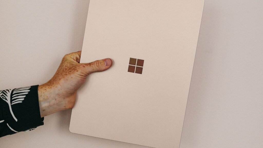
A minimalist logo is a design stripped down to its most essential elements—think clean lines, simple shapes, limited colors, and clear typography. It’s about clarity, not complexity. These logos communicate a brand’s identity in a direct, no-nonsense way that is both visually appealing and easy to digest.
Famous examples include the Nike swoosh, Apple’s iconic apple, and Airbnb’s Bélo symbol. Each uses minimal elements to express powerful brand identities. This stripped-back approach helps communicate brand values like modernity, confidence, and sophistication—without overwhelming the viewer.
From a branding perspective, minimalist logos allow a business to focus on what matters most—being instantly recognizable, adaptable, and emotionally resonant.
2. Minimalist Logos Are Easy to Use Across All Media
One of the strongest advantages of minimalist logos is their versatility. In today’s world, logos need to scale across a wide range of formats—from app icons and social profile images to websites, print materials, merchandise, and video thumbnails. A minimalist logo adapts effortlessly.
Thanks to their simplicity, these logos retain clarity and visual strength at any size or resolution. Whether you’re printing on a tiny product label or showcasing your brand on a 4K display, a minimalist logo maintains its impact.
Additionally, minimalist logos often work well in both color and black-and-white, making them highly effective for screen, print, embossing, engraving, or laser cutting. This flexibility translates into lower production costs and greater consistency across every marketing channel.
3. Psychologically, a Minimalist Logo Is Easier to Remember
From a psychological standpoint, minimalist logos are easier to recognize and remember. The human brain is wired to seek simplicity. When faced with multiple stimuli, we gravitate toward visuals that are easier to process and recall.
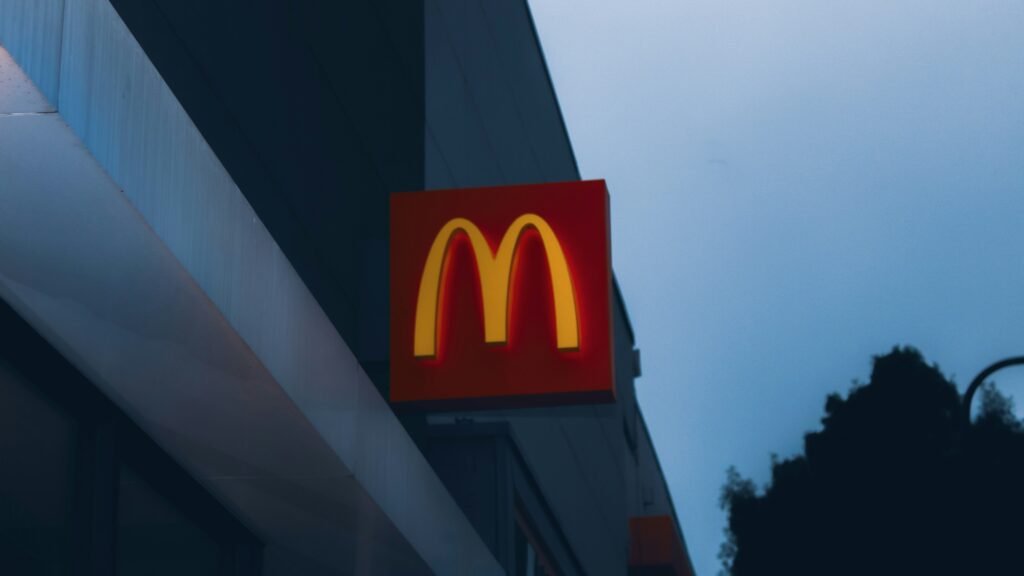
A well-designed minimalist logo uses this to its advantage. By removing excess detail, the logo becomes more distinct and memorable—qualities that are crucial in competitive markets. Think of the Twitter bird or McDonald’s golden arches. These are not just logos—they’re mental shortcuts that instantly evoke emotion, identity, and trust.
Studies show that people form an impression of a brand within 7 seconds, and logo recall can significantly influence brand loyalty. Minimalist logos allow brands to make a powerful first impression—fast.
4. Minimalist Logos Tend to Be More Timeless

While trends in color and style may come and go, minimalist logos stand the test of time. Why? Because they’re built on foundational design principles—balance, proportion, and clarity—rather than short-lived design gimmicks.
For example, Apple’s modern logo, introduced in 1977, has undergone only minor refinements while remaining instantly recognizable. The same can be said for brands like Chanel, IBM, or Mastercard. These timeless logos have proven that clean design endures, saving brands from frequent (and expensive) rebranding efforts.
Timeless logos also help preserve brand equity. When customers can recognize your identity year after year, you build long-term trust and loyalty.
5. Is a Minimalist Logo Right for Every Brand?
Despite its many advantages, minimalism isn’t for everyone. The effectiveness of a minimalist logo depends on your industry, audience, and brand personality.
For example, luxury brands often benefit from minimalist logos because they suggest exclusivity and elegance. Tech startups favor them for a modern, forward-thinking image. But brands that serve children, focus on heritage, or need to express a quirky personality might require a more detailed or illustrative approach.
The key is to balance form with function. Your logo should not only look great but also authentically represent your values and voice. Minimalism works best when it’s intentional, not just trendy.
Conclusion
Minimalist logos are more than a style—they’re a strategic design choice that helps brands thrive in today’s noisy, digital world. By focusing on simplicity, they offer clarity, flexibility, memorability, and timeless appeal. Whether you’re a startup or an established business looking to rebrand, embracing minimalist logo design can set you apart with confidence and sophistication.
Ready to Craft a Clean and Clever Logo?
Let Layerice Design help you create a minimalist logo that speaks volumes—without saying too much. Our expert branding team knows how to capture the essence of your business in a design that’s modern, functional, and unforgettable.
👉 Contact Layerice Design today and discover how “less” can truly do more for your brand.


